If you’ve ever seen the aurora, it feels almost unreal. A quiet sky. Then movement. Light, shifting, folding, flowing.
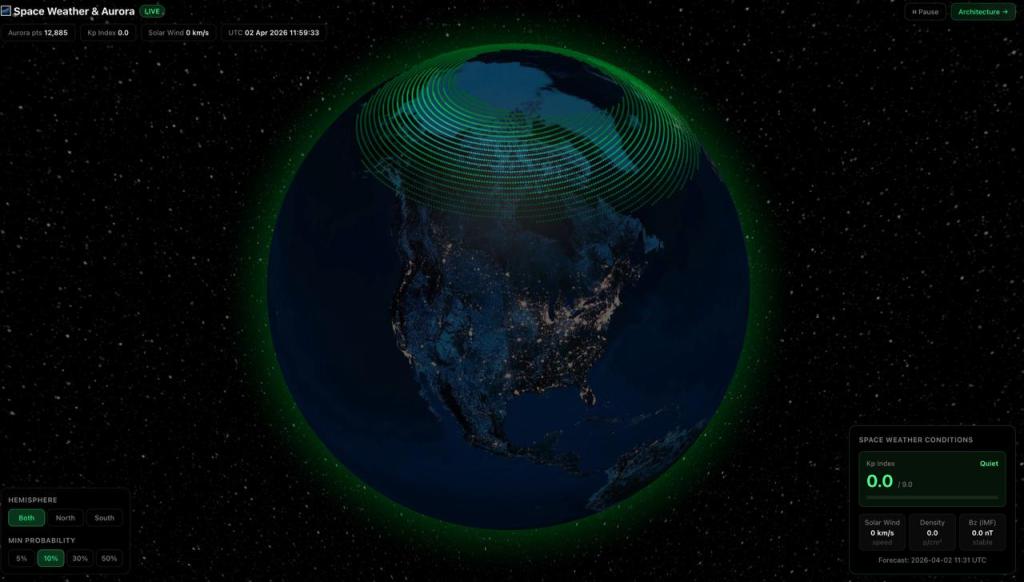
Let’s cut the chase – to all Aurora lovers, here is the DEMO i build for LIVE Aurora tracking on 3D WebGL. Open to play with it. Also, don’t scroll till the end – else you’ll see so much DEBRIS in the sky up there !!
From Light to Signal
Another weekend project, where I built a live Space Weather & Aurora visualization on a 3D globe.
Not as a visual experiment. But as a way to understand what’s happening above us — in real time.
The aurora isn’t random. It’s the visible edge of a system.
A system driven by:
- Solar wind
- Magnetic field interactions
- Charged particles entering Earth’s atmosphere
- Energy release at ~120 km altitude
What we call “beautiful” is actually data becoming visible.
What the System Is Reading
The model pulls directly from NOAA Space Weather Prediction Center.
Updated every 5 minutes. Under the hood:
- Aurora probability grids
A global 360×180 map showing where activity is likely to occur - Planetary Kp index (0–9)
A measure of geomagnetic disturbance - Solar wind + magnetic field data (L1 point)
Captured upstream before it reaches Earth
All of this is fused and rendered onto a WebGL globe. Not as charts. But as a system you can see.
Why a Globe Changes the Way You Understand It
We’re used to flat maps. Dashboards. Charts. Numbers. But space weather isn’t flat.
It’s directional.
It’s global.
It’s dynamic.
When you place aurora activity at its actual altitude —
and see it wrapping around the poles —
you stop thinking of it as an event.
You start seeing it as a planetary interaction. That shift matters. Because the implications are not local.
What the Aurora Is Quietly Telling Us
When the Kp index rises, it’s not just “strong aurora tonight.” It’s a signal.
A signal that Earth’s magnetic field is being disturbed. And that has consequences:
- GPS accuracy can degrade
- Power grids can experience induced currents
- Satellites face increased radiation exposure
- Communication systems can behave unpredictably
In extreme cases, infrastructure itself becomes vulnerable.
A Historical Reminder
In 1859, during the Carrington Event:
- Telegraph systems failed globally
- Operators reported electric shocks
- Some systems functioned even after being disconnected from power
That wasn’t an anomaly. It was a preview.
The Shift That’s Happening
We are moving into a world where:
Space weather is not just academic.
It is operational.
Airlines monitor it.
Satellite operators depend on it.
Defense systems track it.
Power grid operators prepare for it.
And increasingly:
Technology platforms are starting to visualize it.
Why I Built This
Because I wanted to see the system — not just the output.
When you watch aurora on a globe, in real time, with data flowing every few minutes, you begin to ask different questions:
How often are we exposed to geomagnetic stress?
How resilient is our infrastructure to it?
What happens when dependency on satellites increases further?
The visualization doesn’t answer these. But it makes them impossible to ignore.
What I Felt Watching It Live
Not excitement. Not even curiosity. Something closer to awareness. The realization that:
There is a layer of activity above us — constant, dynamic, measurable —
that most of us never consider.
Until it affects something we rely on.
What’s Next
I’m exploring this further. Bringing more layers into the globe – like DEBRIS from tons of satellite that we shoot up there.
Because once you start seeing the world this way, flat dashboards stop being enough.

Leave a comment